Configure Color Themes
Basics
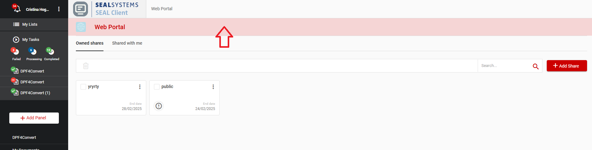
For SEAL Operator, you can change or add color themes. As a default the standard SEAL Systems theme is used.
Use the following steps to change or add color themes:
-
Change to the directory
%PROGRAMFILES%\SEAL Systems\seal-operator-ui. -
Create the directory
custom_themesif it does not exist yet. -
Change to the new directory.
-
Create a new file
themes.jsonif it does not exist yet. -
Copy the following template to the file. This is the SEAL standard theme. You can then modify the colors.
{
  "light-theme": {
    "primary": "#009DE0",
    "accent": "#005F9B",
    "text": {
      "300": "#E0E0E0",
      "400": "#BDBDBD",
      "500": "#9E9E9E",
      "600": "#757575",
      "700": "#616161",
      "800": "#424242",
      "A100": "#FFFFFF"
    },
    "background": "#FAFAFA",
    "components": {
      "toolbar": "#FFFFFF",
      "field": "#FFFFFF",
      "dialog": "#FFFFFF",
      "header": "#FFFFFF",
      "dropdown": "#FFFFFF",
      "card": "#FFFFFF",
      "item": {
        "default": "#FFFFFF",
        "focused": "#E1EFF7",
        "hovered": "#FAFAFA",
        "condensed": "#FAFAFA"
      },
      "gutter": "#FFFFFF",
      "collapsable-actions": "#FFFFFF",
      "default-button": "#FFFFFF",
      "parent-metadata": "#FFFFFF",
      "share-details": "#FFFFFF",
      "task-output": "#FFFFFF",
      "search": "#FFFFFF",
      "metadata-editor": "#FFFFFF",
      "document-metadata": "#FFFFFF",
      "document-preview": "#FFFFFF"
    }
  }
}
- If you only want to change a few of the colors it is sufficient to copy only for example the following template to the file. The rest is taken from the standard theme.
{
  "light-theme": {
    "primary": "#009DE0",
    "accent": "#005F9B"
  }
}
Multiple themes
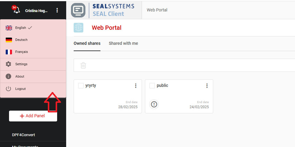
You can also add various themes to themes.json. The users then can choose between these themes in the themes settings.
{
  "my-first-theme": {
    "primary": "#AAAAAA",
    "accent": "#005F9B",
    "text": {
      "300": "#E0E0E0",
      "400": "#BDBDBD",
      "500": "#9E9E9E",
      "600": "#757575",
      "700": "#616161",
      "800": "#424242",
      "A100": "#FFFFFF"
    },
    "background": "#FAFAFA"
  },
  "my-second-theme": {
    "primary": "#BBBBBB",
    "accent": "#005F9B",
    "text": {
      "300": "#E0E0E0",
      "400": "#BDBDBD",
      "500": "#9E9E9E",
      "600": "#757575",
      "700": "#616161",
      "800": "#424242",
      "A100": "#FFFFFF"
    },
    "background": "#FAFAFA"
  }
}
If there are multiple themes in the themes.json file and a new user logs in for the first time, the first theme will be selected by default.
Meaning of the values
All colors have to be defined in RGB-HEX format.
primary→ the main color of the application, used mainly as background for certain elementsaccent→ a color used for highlighting element, usually buttons and linkstext→ colors applied to text based on the importance, with darker shades indicating higher emphasis and lighter tones for less critical informationbackground→ background color in panelscomponents→ colors used as background for components (eg. toolbars, table rows etc.)
Where different colors from the theme are used:
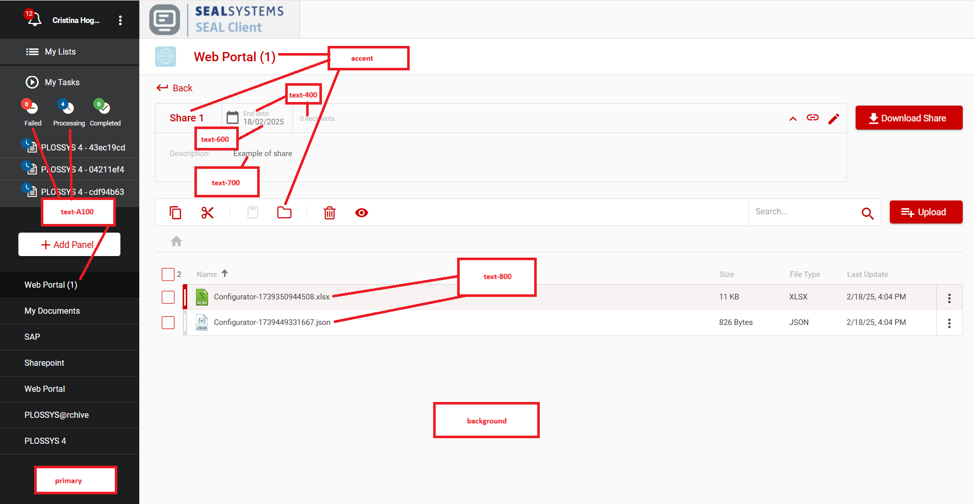
components.toolbar
components.field
components.dialog
components.header
components.dropdown
components.card
components.item
components.gutter
components.collapsable-actions
components.default-button
components.parent-metadata
components.share-details
components.task-output
components.search
components.metadata-editor
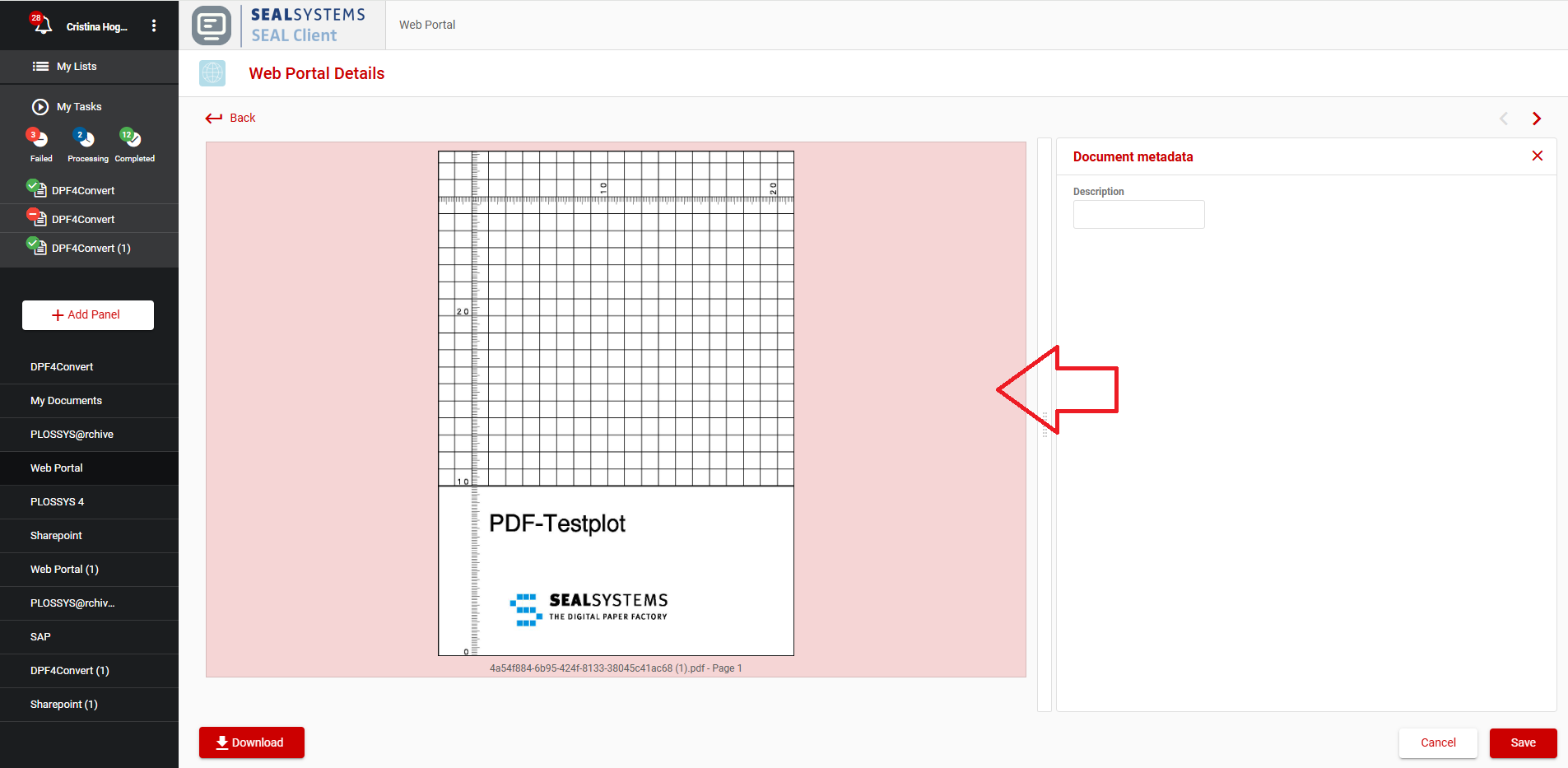
components.document-metadata
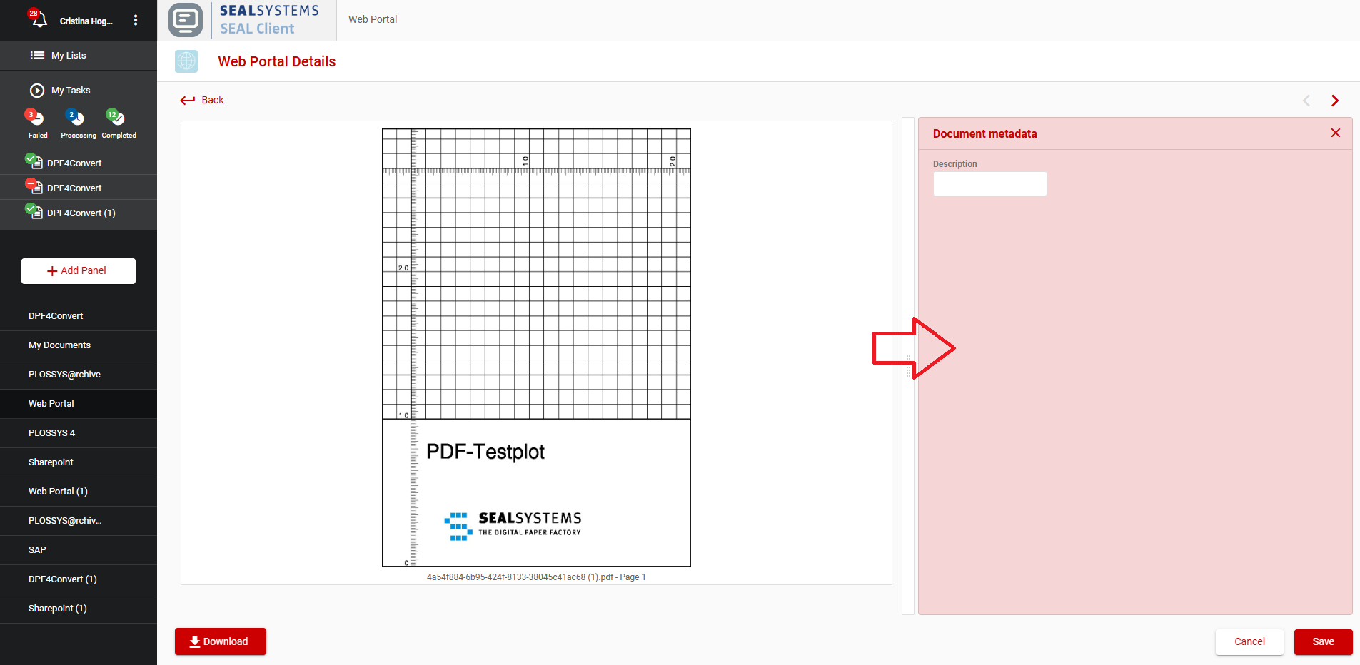
components.document-preview
How to translate the names of the custom themes
In order to show nice theme names to the user in the themes settings you have to provide translations for the configured theme names (my-firsttheme and my-second-theme in the above example).
In the additional_languages folder you have to add a {{ language }}-diff.json file (for example en-diff.json) for each supported language or edit them if they already exist.
In this files you have to add the names of the custom themes:
  {
  ...,
  "Themes": {
    ...,
    "my-first-theme": "A nice theme",
    "my-second-theme": "Another nice theme"
  },
  ...
}
See also Change an Existent Translation for this.