Examples for Panel Customization
Hint - best practice
Don't work with the default configuration files but create your own custom copies. For more detailed instructions, refer to Create Custom Configuration Files.
To activate the changes you made, save the configuration files and restart the services seal-operator-p4 and seal-operator-server.
operator service start seal-operator-p4 seal-operator-server
Hint - activating hidden fields
In the provided panel.json and settings.json files, extra fields are available that are not shown in the default configuration. Those are already preconfigured with the available field values. You only have to activate them.
To do that, remove the following line at the end of the field description. Also remove the comma at the end of the previous line to the keep the JSON syntax correct.
"visibleIf": {}
Add a Text Field
Text fields can be freely filled in by the user. You can use them to pass header parameters for stamps or entries on the cover sheet for example.
This is how you add a text field to the panel:
-
In both customized panel configuration files, add the text field into the
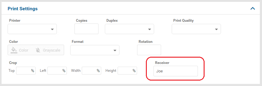
propertieslist and specify the attributes of the text field, for example, the language-dependent label of the text field:Example - text field for specifying the receiver
{ ... "properties": { ... "PLS_STAMP_1": { "type": "string", "description": { "de": "Empfänger", "en": "Receiver" }, "default": "Joe" }, ... } ... } -
In both customized panel configuration files, add the text field to the
fieldsetsat the place where you want to have it in the panel:Example
{
    ...
    "fieldsets": {
      ...
      "fields": {
        ...
        "PLS_STAMP_1",
        ...
      },
      ...
    }
    ...
}
Add an Option Field
With option fields, the user can select between different option. For example, they are used for passing fix values for stamps.
This is how you add an option field to the panel:
-
In both customized panel configuration files, add the option field into the
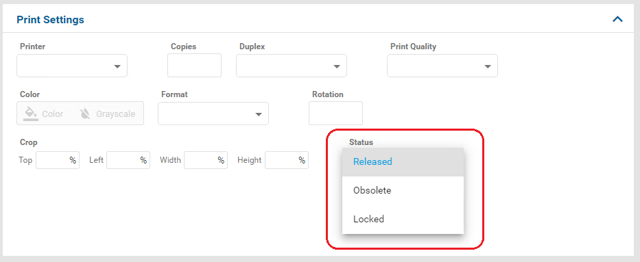
propertieslist and specify the attributes of the option field, for example, the values which can be selected by the user:Example - option field providing different values for the status
{ ... "properties": { ... "PLS_STAMP_0": { "type": "string", "description": "Status", "default": "RELEASED", "widget": "select", "oneOf": [ { "enum": [ "RELEASED" ], "description": { "de": "Freigegeben", "en": "Released" } }, { "enum": [ "OBS" ], "description": { "de": "Obsolet", "en": "Obsolete" } }, { "enum": [ "LOCKED" ], "description": { "de": "Gesperrt", "en": "Locked" } } ] } ... } ... } -
In both customized panel configuration files, add the option field to the
fieldsetsat the place where you want to have it in the panel:Example
{
    ...
    "fieldsets": {
      ...
      "fields": {
        ...
        "PLS_STAMP_0",
        ...
      },
      ...
    }
    ...
}
Add a Radio Button
With radio buttons, the user can select one option out of several options. For example, a radio button can be used to select between b/w, color or grayscale output.
This is how you add an radio button to the panel:
-
In both customized panel configuration files, add the radio button into the
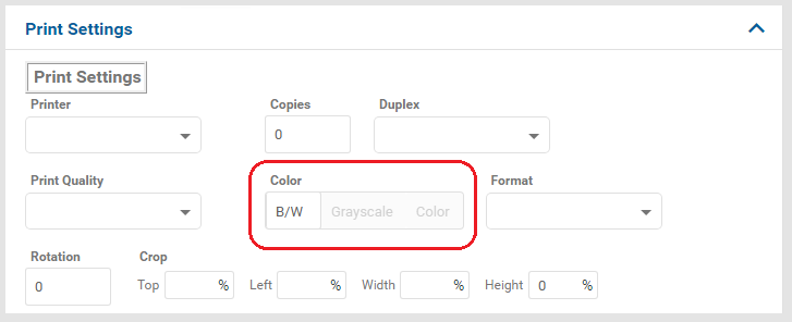
propertieslist and specify the available values.Example - radio button providing different color modes for the output
{ ... "properties": { ... "Color": { "type": "string", "fillBy": "Capabilities/ColorDefault", "default": "bw", "description": { "de": "Farbe", "en": "Color" }, "widget": "toggle", "oneOf": [ { "enum": [ "bw" ], "description": { "de": "S/W", "en": "B/W" } }, { "enum": [ "gray" ], "description": { "de": "Graustufen", "en": "Grayscale" } }, { "enum": [ "color" ], "description": { "de": "Farbe", "en": "Color" } } ], "visibleIf": { "Capabilities/Color": [ true ] } } ... } ... } -
In both customized panel configuration files, add the radio button to the
fieldsetsat the place where you want to have it in the panel:Example
{
    ...
    "fieldsets": {
      ...
      "fields": {
        ...
        "Color",
        ...
      },
      ...
    }
    ...
}
Add a Number Field
Number fields can be used for numeric settings. In der default configuration of the panel, number fields are used for the copies and the rotation angles.
This is how you add a number field to the panel:
-
In both customized panel configuration files, add the number field into the
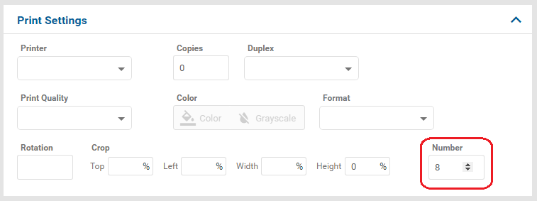
propertieslist and specify the attributes of the number field, for example, the language-dependent label of the number field:Example - even number between 4 and 16
{ ... "properties": { ... "PLS_EVEN": { "type": "number", "description": { "de": "Nummer", "en": "Number" }, "multipleOf": 2, "minimum": 4, "maximum": 16, "default": 8 }, ... } ... } -
In both customized panel configuration files, add the number field to the
fieldsetsat the place where you want to have it in the panel:Example
{
    ...
    "fieldsets": {
      ...
      "fields": {
        ...
        "PLS_EVEN",
        ...
      },
      ...
    }
    ...
}
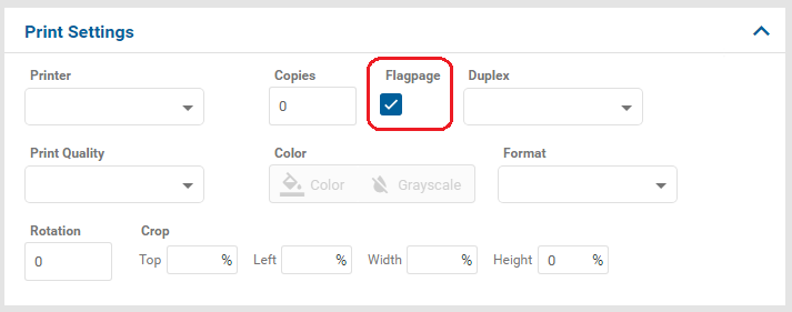
Add a Checkbox
Checkboxes can be used to switch a setting on or off, for example to activate a flagpage.
This is how you add a checkbox to the panel:
-
In both customized panel configuration files, add the checkbox into the
propertieslist and specify the attributes of the checkbox, for example, the language-dependent label of the checkbox:Example - checkbox for the flagpage
{
    ...
    "properties": {
      ...
      "PLS_FLAGPAGE": {
        "type": "boolean",
        "description": {
          "de": "Randbeschriftung",
          "en": "Flagpage"
        },
        "default": true
      },
      ...
    }
    ...
}
Hint -
YandNThe PLOSSYS 4 (
P4) connector maps any boolean value, for example,true,1orNO, toYorNaccordingly and passes this to PLOSSYS 4. -
In both customized panel configuration files, add the checkbox to the
fieldsetsat the place where you want to have it in the panel:Example
{
    ...
    "fieldsets": {
      ...
      "fields": {
        ...
        "PLS_FLAGPAGE",
        ...
      },
      ...
    }
    ...
}
Change the Default Value of a Field
You can specify a default value for every field no matter its type. This value will be used if the user doesn't specify anything else.
This is how you change the default of a field in the panel:
-
In both customized panel configuration files, change the value of the
defaultattribute of the field:Example - new default is
Jane{ ... "properties": { ... "PLS_STAMP_1": { "type": "string", ... "default": "Jane", ... }, ... } ... }
Mark a Field as Mandatory
You can specify that a parameter has to have a value no matter the type of the field. This value can either be set by the user or by default.
This is how you configure a field as mandatory:
-
In
panel-<customer_name>.json, add the required field to therequiredlist:Example -
PLS_STAMP_0is required{ ... "json_schema": { ... "required": ["Printer", "Copies", "PLS_STAMP_0"], "properties": { ... } ... }, ... }
Dependencies between Fields
A field in the panel can be displayed depending on a value in another field. If, for example, the printer does not have a folding unit, a Fold Type field does not make sense.
This is how you specify the dependency between fields:
-
In both customized panel configuration files, specify the field and value on which the other field depends in the
visibleIfelement:Example -
Fold Typeoption field is only displayed with ROWE printer{ ... "properties": { ... "PLS_FOLD_TYPE": { "type": "string", "default": "nonefold", "description": {"de": "Faltart", "en": "Fold Type"}, "widget": "select", "oneOf": [ { "enum": [ "nonefold" ], "description": {"de": "keine Faltung", "en": "No folding"} }, { "enum": [ "dina_heftrand" ], "description": {"de": "Heftrand", "en": "Binding margin"} }, { "enum": [ "dina_heftstr" ], "description": {"de": "Heftstreifen", "en": "Filing strip"} } ], "visibleIf": { "Printer": [ "ROWE" ] } ... } ... } ... }Hint - any parameter
Any parameter in can be used as criteria for dependencies.
Change the Field Order
The fields in a panel are displayed in the same order as specified in the fieldsets element of the configuration files.
This is how you change the order the fields in a panel:
-
In both customized panel configuration files, change the order of the elements in the
fieldsetslist:Example
{
    ...
    "fieldsets": [
      {
        ...
        "fields": [
          "Printer",
          "Copies",
          "PLS_FLAGPAGE",
          "Duplex",
          "Quality",
          "Color",
          "Format",
          "rotationAngle",
          "cropSelection"
        ]
      }
    ...
    ]
}
Group Fields
The fields in the panel can be arranged in groups with a separate title.
In the example below, we assume a text field for the receiver and a checkbox for the flagpage have already been configured. Now, these are to be arranged in a new group.
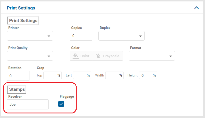
This is how you arrange fields in a separate group with a title:
-
In both customized panel configuration files, generate a new list element in
fieldsetscontaining the fields to be grouped and specify the (language-dependent) title in thetitleelement:Example - separate group for the receiver and the flagpage
{
  ...
  "fieldsets": [
    {
      "title": {"de": "Allgemein", "en": "General"},
      "fields": [
        "Printer",
        ...
        "cropSelection"
      ]
    },
    {
      "title": {"de": "Stempel", "en": "Stamps"},
      "fields": [
        "PLS_FLAGPAGE",
        "PLS_STAMP_0"
      ]
    }
  ]
  ...
}
Enable B/W Color Mode
By default, only Color and Grayscale are available as color modes in the PLOSSYS 4 panel. If you want to enable the Black & White color mode too, you need to change the panel configuration for the PLOSSYS 4 panel:
-
In both customized panel configuration files for the PLOSSYS 4 panel, search for the
Colorproperty and extend it by the settings forbwas follows:{ ... "json_schema": { ... "Color": { "type": "string", "fillBy": "Capabilities/ColorDefault", "default": "bw", "description": "Color", "widget": "toggle", "oneOf": [ { "enum": [ "color" ], "description": "color", "icon": "format_color_fill" }, { "enum": [ "gray" ], "description": "gray", "icon": "format_color_reset" }, { "enum": [ "bw" ], "description": "bw" } ], "visibleIf": { "Capabilities/Color": [ true ] } } ... } ... }Hint - icons
The icons which can be used for the items in the user interface, such as
format_color_fillorformat_color_resetin the configuration above, are provided by the Angular framework. For more information, refer to the Internet.
Number of Preview Pages
If and how many preview pages will be displayed, depends on three values:
-
CREATE_PREVIEW: Defines if a preview will be generated. DefaultY. -
PREVIEW_PAGE_COUNT: Defines the number of preview pages generated per document. -
preview_page_countin thepanel.json: Defines the number of preview pages that will be displayed in the respective panel.
This is how you specify them:
-
Export the complete configuration of SEAL Operator from Consul to a YAML file with the following command. So you're making sure the current configuration settings are being used.
operator config export <filename>.yml --insecure -
Edit the exported file
<filename>.yml. -
If your file contains an entry for
CREATE_PREVIEW, delete it or change the value toY.env: service: ... operator-fileupload: tag: any: CREATE_PREVIEW: Y ... -
In the
envsection, specify thePREVIEW_PAGE_COUNTkey for theseal-operator-fileuploadservice. Otherwise the value set in thepanel.jsonwill have no effect.env: service: ... operator-fileupload: tag: any: MONGO_FILEUPLOAD_URL: 'mongodb://<mongodb_server>:27017/operator-fileupload' PREVIEW_PAGE_COUNT: 3 ... -
Save the file.
-
Re-import it to Consul.
operator config import <filename>.yml --insecure -
In the panel configuration file for the connector, search for the
details_viewproperty. Change the value forpreview_page_count.Example -
panel.jsonfor the Web Portal panel[ { "name": "Web Portal", "type": "webportal", "pid": "8376eb11-68e7-49c5-af60-5d46cb102304", "json_schema": { "$schema": "http://json-schema.org/schema#", "type": "object", "properties": { "description": { "type": "string", "description": { "de": "Beschreibung", "en": "Description" } } }, "fieldsets": [ { "fields": [ "description" ] } ] }, "details_view": { "custom_tools": [], "restricted_fields": [], "preview_page_count": 3, "hide_preview_actions": true } } ]